


With the renewed love for audio in recent years, spurred by podcasting, and the onslaught of new technologies for consumers to listen, radio’s reach among the U.S. population is still massive. That’s according to the latest Audio Today report from Nieslen.
Nielsen reports that radio still reaches 93% of the American population. That includes 93% of the 18+ population and 98% of the 50 and over crowd. The 18-34 demo is the lowest, but still stands at 87% according to Nielsen. The ratings firm concludes that “only AM/FM radio can deliver the scale advertisers need.”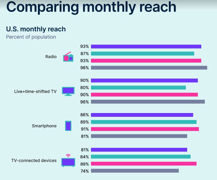
Radio often gets criticized for not being relevant to the younger generations. According to Nielsen, in that 18-34 demo, where radio reaches 87%, no other audio service comes close. Spotify lands at 41%, Pandora 21%, Apple Music 18%, Amazon Music at 14% and Satellite Radio at 7%. Nielsen states that radio generates 55% more incremental reach than streaming music, podcasting and satellite radio.
The radio industry has recognized that many listeners, while still listening, are moving to their streams. Nielsen’s report confirms that theory. In Q3 of 2020, 7% of radio’s listeners were doing so on a radio station stream. In Q1 of this year that number jumped to 12%.
Nielsen also reported the obvious, that radio’s most out-of-home use was being done in the car. And, that 70% of all radio listening is done outside the home.
As mentioned earlier in this story, podcasting has helped fueled a new surge in audio listening. The Nielsen report states that half of daily podcast listeners started listening to podcasts in the past two years alone. And, they are listening to more shows, more often. The increase in podcast listening started with the pandemic, according to Nielsen.


good to know
Velki live registration, Agent list, Register as an agent. 9 WICKETS.
464,7 thousand podcast subscribers as of this writing. After that, in the year 2024, the con so này d’kin will increase to over 504,9 billion people.
The lines are age demos – purple is 18+, green is 18-34, red is 35-49 and gray is 50+. @Bud ‘radio’ as defined by Nielsen is broadcast or a stream of that broadcast signal – that includes all listening devices including smart speakers. As for a breakout of FM/AM – that is not relevant in the context of this data. The data is to show marketers what is possible with radio and that it is the medium with the most reach – more than TV, more than digital. I would estimate that 10-15% of the radio reach is from ‘AM’ band. Hard to get to that number with many AM stations simulcasting on FM translators.
I don’t understand the chart, either. There isn’t a legend to explain what the lines mean.
Did your research include smart speakers?
It’s just not massive. If so, the revenue would be massive, yet it’s going away. Budgets being cut, jobs being lost. These pieces just don’t fool people anymore. The advertisers are abandoning expensive and boring “radio”… also, this is from the same company that uses 1,000 people to tell you what 2 million are doing…. insanity.
Dont worry. The I Heart Ad builder will come to the rescue.
Just what is “Radio”? AM and FM have diverged so much as far as content and demographics. It would be interesting to see a breakdown of the two and any other sources that make up the “Radio” category.
I too felt the data might be a bit ambiguous. Reaching the public, i.e. exposure and time spent listening are not quite the same. You do see a trend towards a significantly older population though these numbers seem to imply good listenership from much younger demographics. Yet, if you ask these young folks they will often claim they do not bother with radio at all and might not even own one except for whatever came with their car. Radio? Well sure, my smart speaker and my mobile.
Many radio stations have real-time streams of their content that can be accessed from mobile devices and smart speakers. You can even ask Alexa to play _________ station. Just because they aren’t tuning in via a physical “radio”, doesn’t mean they aren’t listening to regular analog radio stations! If anything, technology has increased access to radio stations.
Sam, you just don’t get it. You’re supposed to parrot the multitudes that no longer work in radio and forecast radio’s imminent demise (first predicted in 1927) like Mr. Bartman above.
Get with the program, dammit!
Yeah, if we don’t like reality, kill the messenger, right??! Lol
I don’t understand the chart, it doesn’t explain the graphs, is there information missing? For example, what does the “Smartphone” information represent, what do the different colors represent? All this should be sourced on the chart, right?
Comments are closed.