


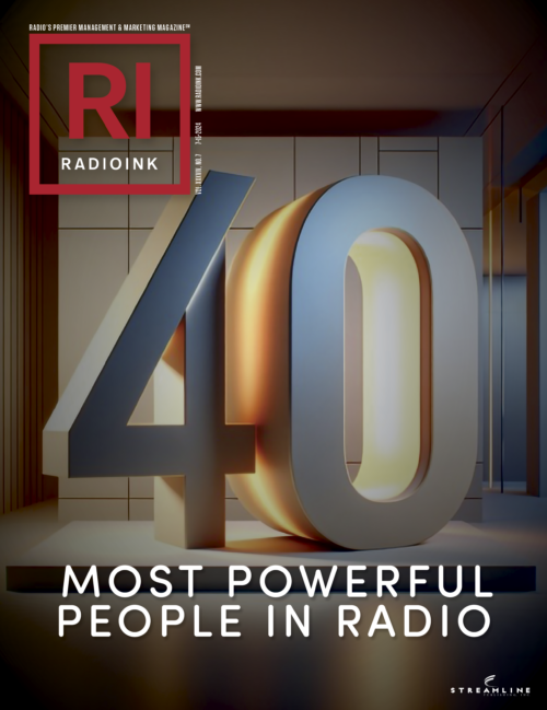
(By Deborah Parenti) Today marks two debuts for Radio Ink. As is our custom in July, this month’s issue of Radio Ink Magazine reveals the list of 2024’s Most Powerful People in Radio. It’s a list that the industry, our readers, and we have taken seriously since 1996.
In a year that has seen a legislative battle to keep AM radio in the dashboard, the threat to free, local radio posed by the American Music Fairness Act, organizational shakeups within some radio groups, and the ever-evolving challenges and opportunities presented by AI, it’s been a transformative year. Many established leaders have demonstrated their ability to adapt and thrive and new leaders have emerged.
And it’s been a transformative year at Radio Ink as well. Two new editors have settled in, Cameron Coats online, and Lainie Petersen at the magazine. And along with those transformations, there has been a revitalization of our product. You’ll find it today in our fresh new logo, its first major overhaul in the publication’s 32-year history.
Most of all, print subscribers will see it in a beautiful new magazine full of easier-to-digest content filled with colorful graphics and “fast facts” on things that matter to radio and its multiple platforms.
But one thing has not changed: it’s still “Radio Ink” and for one simple reason. We believe radio is not just a platform delivery system. No matter how it is delivered, radio is content more than anything else. As an industry, we need to remember that and put more effort and emphasis into it.
My thanks to Lainie Petersen, Cameron Coats, Brida Connolly, and Ken Whitney for giving life to this new design. It’s been an intense labor of love and we hope you like the new Radio Ink, that you will let us know what you think, and if you aren’t a current subscriber, that you will give it a try.
Deborah Parenti is Publisher of Radio Ink. Reach Deborah at [email protected]. Read her Radio Ink digital archives here or get her latest Publisher’s Beat each month with a digital or print subscription here.


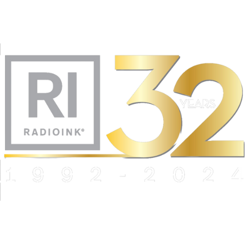
I agree it looks clean and fresh. And I know how much work is involved pulling together a new logo and approach – but I must admit my disappointment in the word Radio yet again being reduced, marginalized, diluted, etc. It is as if we are ashamed of the word Radio. I’m just not and I wish others would make a bigger deal of it.
I love the new clean look and feel. The new logo RI in the red box keeps up with the times. Congratulations on not being afraid of freshening up one of the most respected brands in RADIO.